Style Customization
For technical support, contact support@sapling.ai.
Sapling's SDK UI elements support custom styling through flags and CSS.
During SDK setup, the following attributes can be set as part of the init:
Sapling.init({
    ...
    statusBadge: true,
    appearance: {
      compact: true,
      variables: {
        acceptText: 'Accept', // extended view only
        ignoreText: 'Ignore',
        badgeSize: 8, // px
        badgeMargin: 8, // px
        badgeColor: '#3f51b5',
        badgeErrorColor: '#990000',
      },
      customCSS: '',
    },
});
The elements and injected CSS is encapsulated by a Shadow DOM, and does not affect the rest of your page.
CSS Styling Specificity
Default CSS styling uses direct ID selectors. More specific CSS selectors will override those. As an example, using the selector #sapling-edit-controls #accept-text instead of #accept-text should prioritize the override.
You can read more about how this is handled here: CSS Specificity Documentation
Compact Edit Component Structure
The compact edit component is shown by default. The HTML is structured as follows:
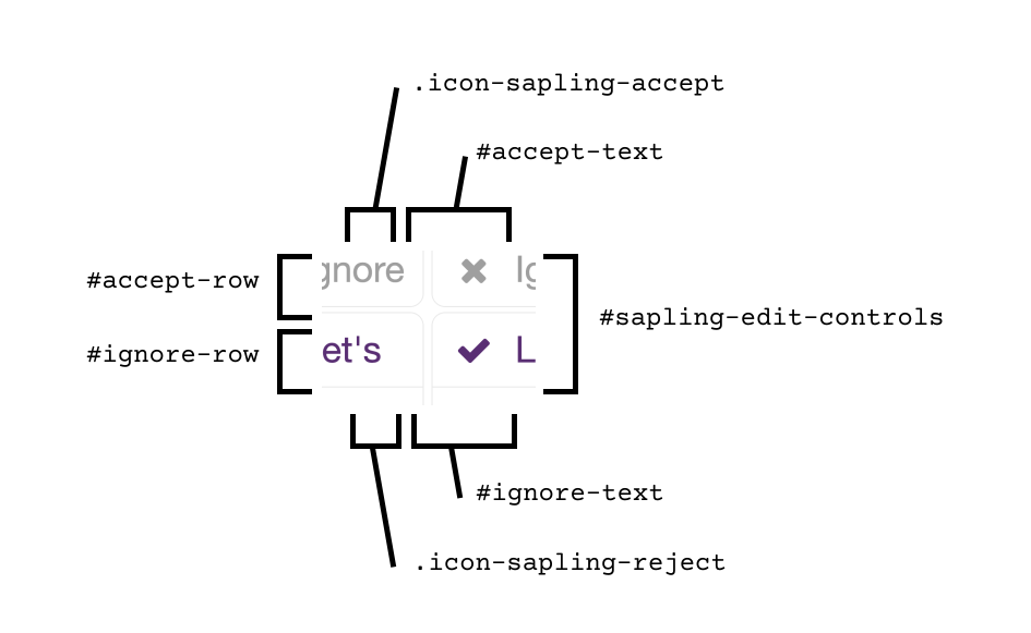
<sapling-controls>
  <div id="accept-row" class="edit-controls-row">
    <div id="accept-button" tabindex="0">
      <div class="icon-sapling-accept"></div>
      <div id="accept-text">${acceptText}</div>
    </div>
  </div>

  <div id="ignore-row" class="edit-controls-row">
    <div id="ignore-button" tabindex="0">
      <div class="icon-sapling-reject"></div>
      <div id="ignore-text">${ignoreText}</div>
    </div>
  </div>
</sapling-controls>
Extended Edit Component Structure
The extended edit component can be shown by initializing the SDK with appearance.compact: false.
The HTML is structured as follows:
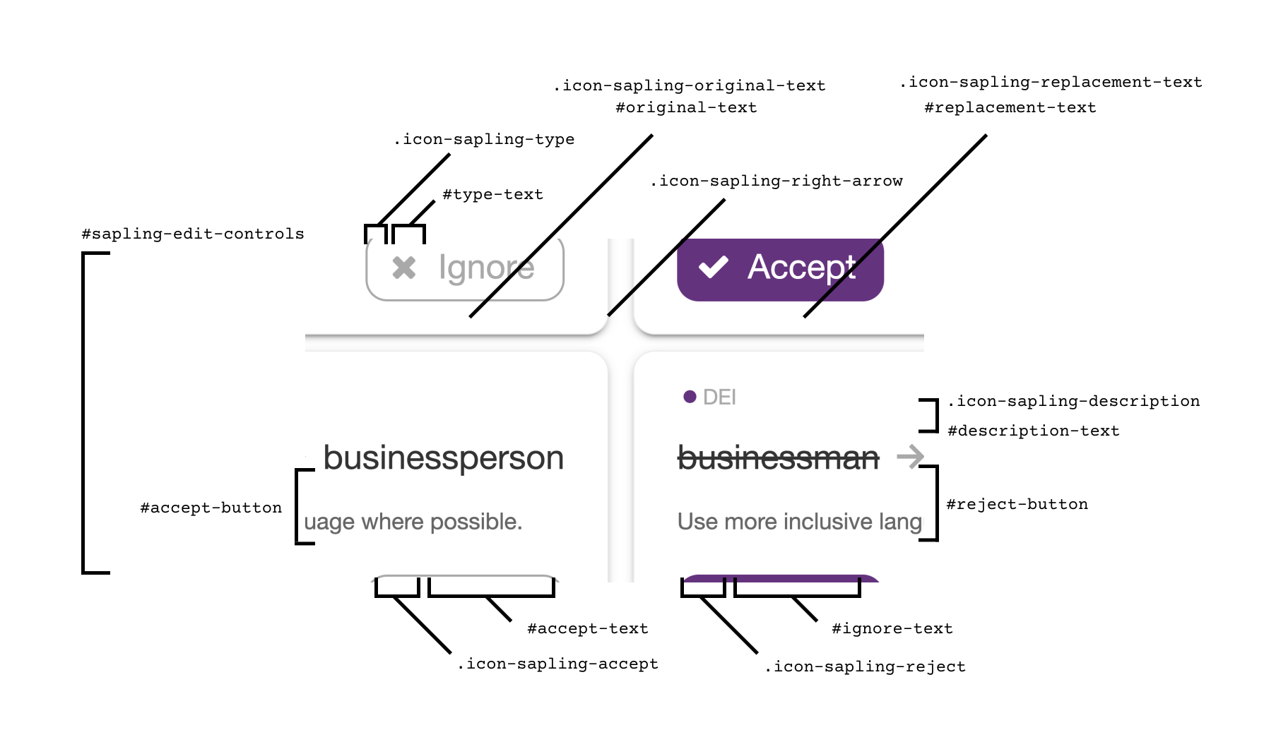
<sapling-controls>

  <div id="type-row">
    <div class="icon-sapling-type"></div>
    <div id="type-text"></div>
  </div>

  <div id="text-row">
    <div id="original-text-row">
      <div class="icon-sapling-original-text"></div>
      <div id="original-text"></div>
    </div>
    <div class="icon-sapling-right-arrow"></div>
    <div id="replacement-text-row">
      <div class="icon-sapling-replacement-text"></div>
      <div id="replacement-text"></div>
    </div>
  </div>

  <div id="accept-row" class="edit-controls-row">
    <div id="accept-button" tabindex="0">
      <div class="icon-sapling-accept"></div>
      <div id="accept-text">${acceptText}</div>
    </div>
  </div>

  <div id="ignore-row" class="edit-controls-row">
    <div id="ignore-button" tabindex="0">
      <div class="icon-sapling-reject"></div>
      <div id="ignore-text">${ignoreText}</div>
    </div>
  </div>

  <div id="description-row" class="edit-controls-row">
    <div class="icon-sapling-description"></div>
    <div id="description-text"></div>
  </div>

</sapling-controls>
Badge Component Structure
The badge is the circle status indicator in the bottom right of the textarea or content-editable.
By default it is a circle with diameter 8px and margins of 8px from the bottom and right corner.
The HTML is structured as follows:
<div class="sapling-badge-container">
  <div class="sapling-status-container">
    <div class="sapling-badge"></div>
    <div class="sapling-badge-spinner"></div>
  </div>
</div>
Outside of the following attributes:
- badgeSize
- badgeMargin
- badgeColor
- badgeErrorColor
You can also set other customizations through the customCSS. As an example, you can slow down the spinner with the following:
.sapling-badge-container .sapling-badge-spinner {
  animation: rotation 4s infinite linear;
}
Example
Here is an example of a green edit control in a dark-themed UI:
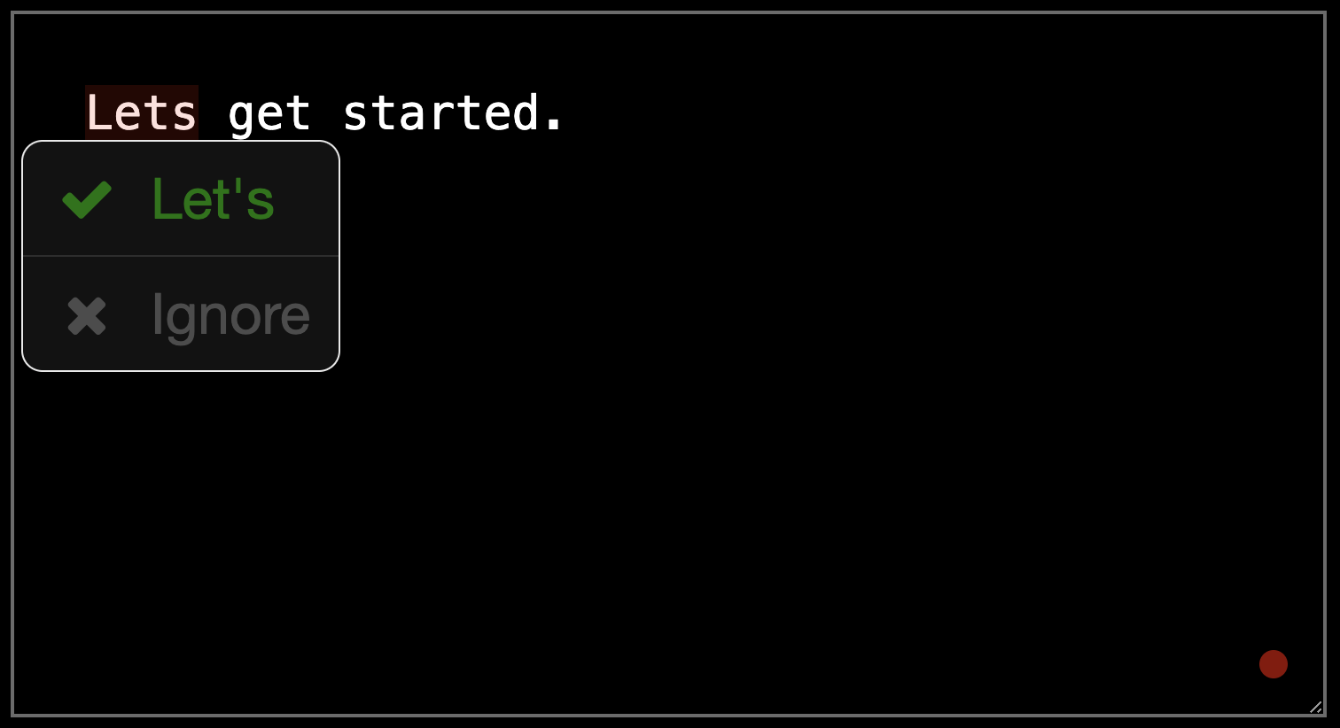
The example HTML to generate that is below (replace API_KEY):
<html>
<head>

<style type="text/css">
  body, textarea {
    background-color: black;
    color: white;
  }
</style>
</head>
<body>

<textarea sapling-ignore="true" id="text-element" rows="10" cols="40" style="padding:20px">
Lets get started.
</textarea>

</body>

<script src="https://sapling.ai/static/js/sapling-sdk-v1.1.1.min.js"></script>
<script type="text/javascript">

  var customCSS = `
  #sapling-edit-controls #edit-controls-buttons {
    border: 0.5px solid #333;
  }

  #sapling-edit-controls #accept-button,
  #sapling-edit-controls #ignore-button {
    background-color: #111;
  }

  #sapling-edit-controls .icon-sapling-accept,
  #sapling-edit-controls #accept-text {
    color: green;
  }

  #sapling-edit-controls #accept-button:hover,
  #sapling-edit-controls #ignore-button:hover{
    background-color: #222;
  }

  #sapling-edit-controls .icon-sapling-reject,
  #sapling-edit-controls #ignore-text {
    color: #565656;
  }

  #sapling-edit-controls #ignore-row {
    border-top: 0.5px solid #333;
  }
  `;

  Sapling.init({
    key: '<api-key>',
    mode: 'dev',
    appearance: { customCSS }
  });

  const textarea = document.getElementById('text-element');
  Sapling.checkOnce(textarea);
</script>
</html>